Temperature Trends at US capitals and major US cities using charts.







What do the Numbers Really Show?
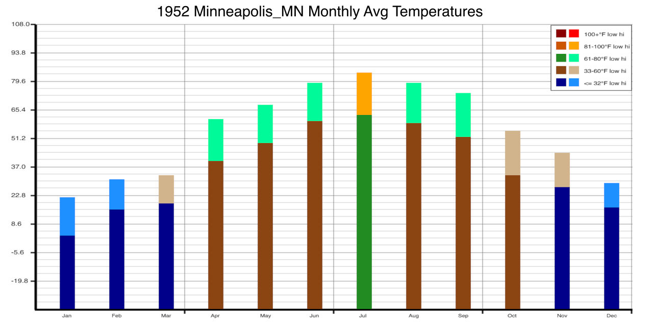
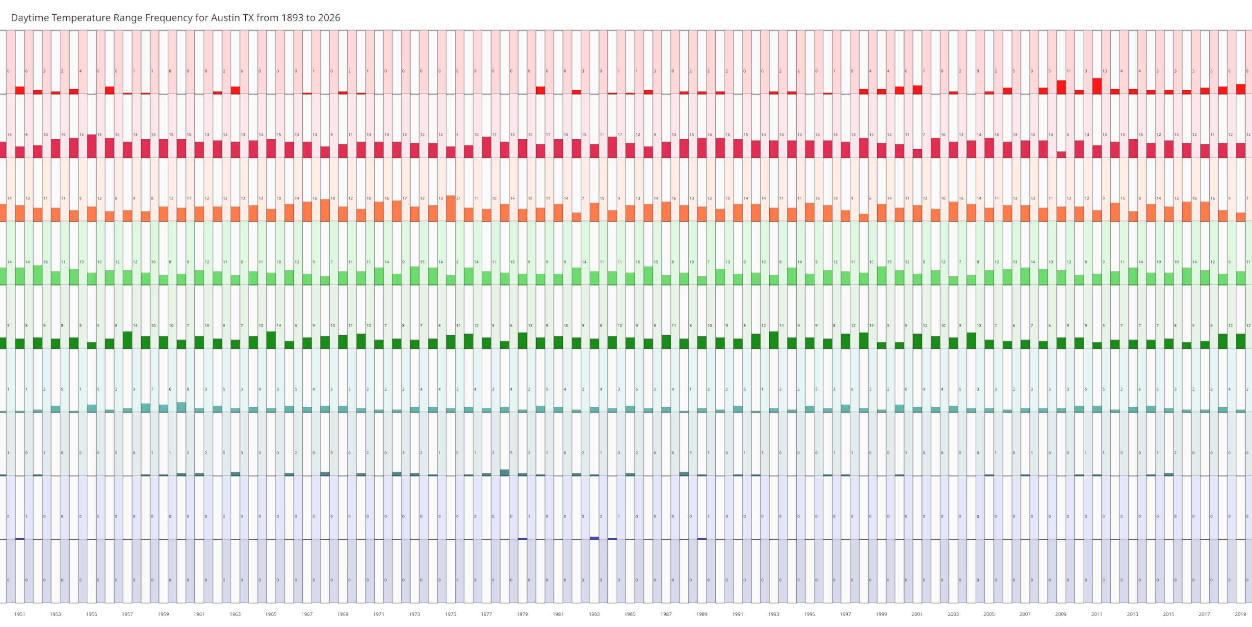
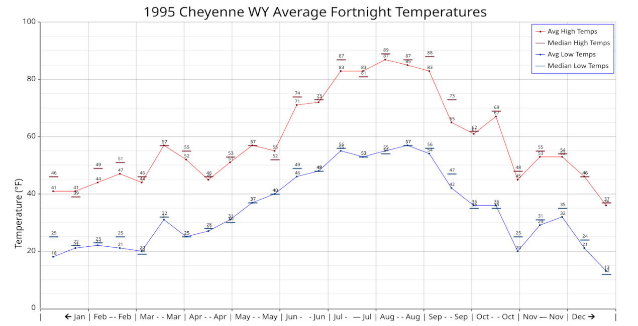
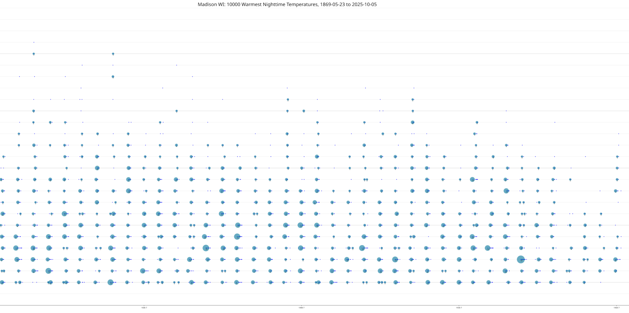
Want to see the average monthly highs and lows for Sacrament in 1893? Want to compare the average weekly temperatures for Phoenix 1937 against Phoenix 2014? Want to watch a “video” of the average temperatures in Boston, where each year is displayed briefly, one year after another. Want to see a city’s highest 4000 temperatures ever recorded, as far back as their records go?
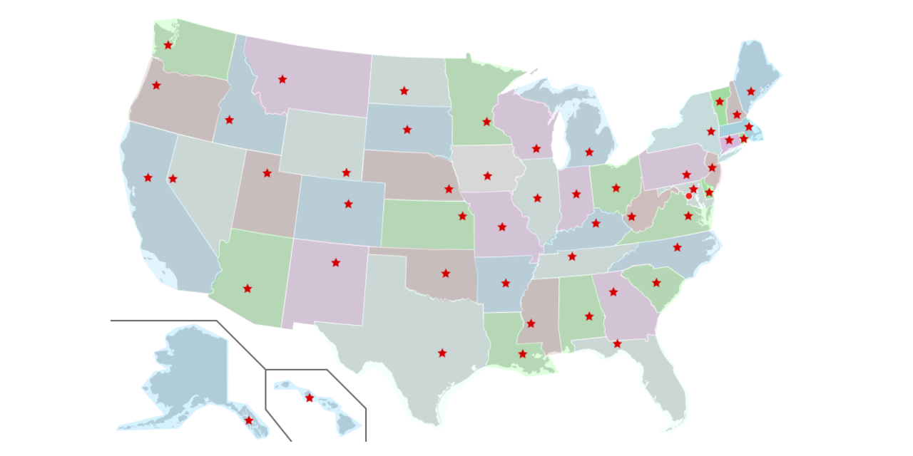
You can see these charts and more on this website. Pick a city and then the kind of chart you want to view and it will be displayed. You can pick a state capital, a city with the largest population, or a city of interest. Altogether about 100 cities are available at this time.
Be sure to visit the blog for insights into the charts